[/fusion_text][/fusion_builder_column][/fusion_builder_row][/fusion_builder_container][fusion_builder_container hundred_percent=”yes” overflow=”visible”][fusion_builder_row][fusion_builder_column type=”1_1″ type=”1_1″ background_position=”left top” background_color=”” border_size=”” border_color=”” border_style=”solid” spacing=”yes” background_image=”” background_repeat=”no-repeat” padding_top=”” padding_right=”” padding_bottom=”” padding_left=”” margin_top=”0px” margin_bottom=”0px” class=”” id=”” animation_type=”” animation_speed=”0.3″ animation_direction=”left” hide_on_mobile=”no” center_content=”no” min_height=”none” first=”true” last=”true” hover_type=”none” link=”” border_position=”all”][fusion_title size=”2″]Responsive Email Design[/fusion_title][fusion_text]
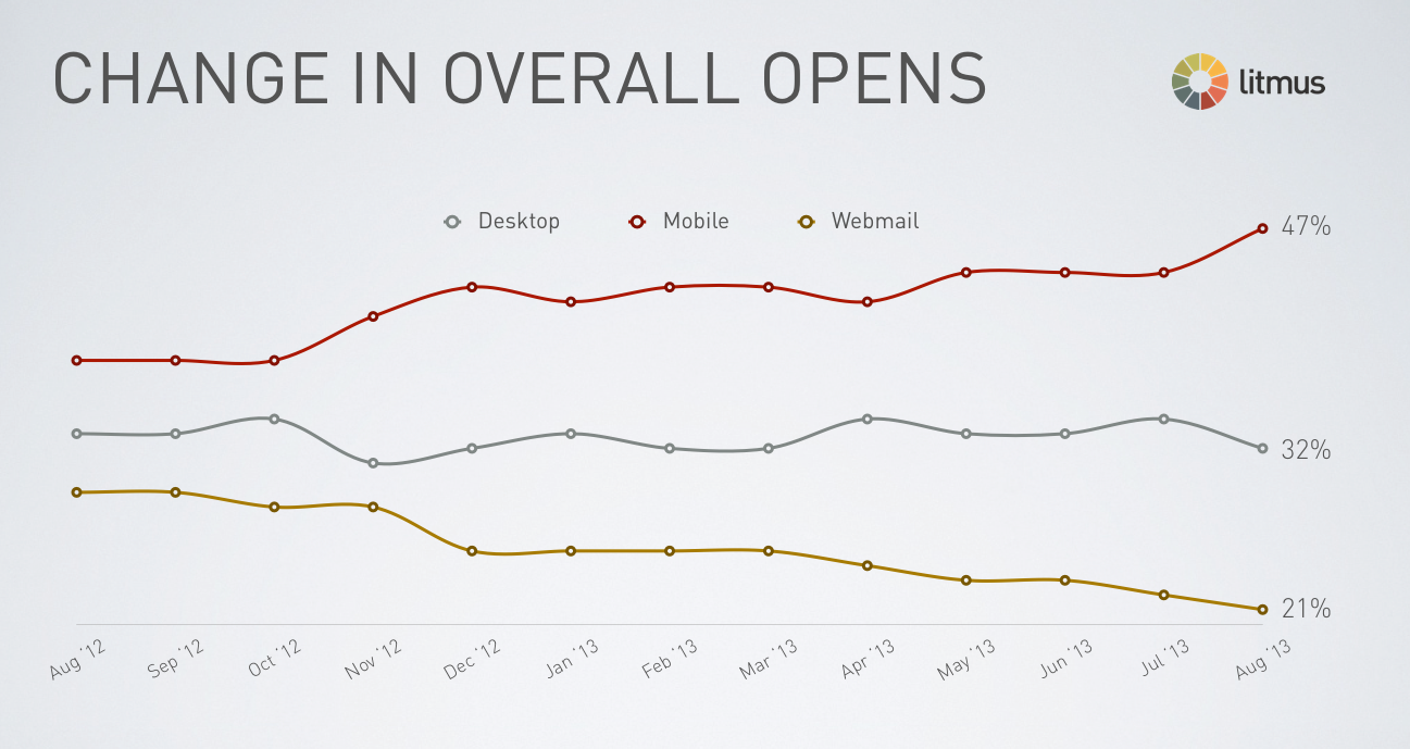
Since 2011, the widespread use of smartphones and tablets has changed the way users use email. In fact, since February 2012, there are more users who open their emails in their smartphones than in any other device. This makes it clear that if you want to send effective emails, they need to look great on any device.
[/fusion_text][/fusion_builder_column][fusion_builder_column type=”1_1″ type=”1_1″ background_position=”left top” background_color=”” border_size=”” border_color=”” border_style=”solid” spacing=”yes” background_image=”” background_repeat=”no-repeat” padding_top=”” padding_right=”” padding_bottom=”” padding_left=”” margin_top=”0px” margin_bottom=”0px” class=”” id=”” animation_type=”” animation_speed=”0.3″ animation_direction=”left” hide_on_mobile=”no” center_content=”no” min_height=”none” first=”true” last=”true” hover_type=”none” link=”” border_position=”all”][fusion_text]
Change in email opens by email client – Source: Litmus
In Elliptic, we carefully analyze behavioral and technological trends related to email usage to improve the quality of our clients’ emails. It is a fact that if you want to attract more visitors to your site, you need to work with a firm that specializes in effective email marketing. Our programmers and designers are constantly creating new ways to increase the effectiveness of email campaigns.
Still not convinced? Look at the difference between a regular email and a responsive email:
[/fusion_text][/fusion_builder_column][fusion_builder_column type=”1_1″ type=”1_1″ background_position=”left top” background_color=”” border_size=”” border_color=”” border_style=”solid” spacing=”yes” background_image=”” background_repeat=”no-repeat” padding_top=”” padding_right=”” padding_bottom=”” padding_left=”” margin_top=”0px” margin_bottom=”0px” class=”” id=”” animation_type=”” animation_speed=”0.3″ animation_direction=”left” hide_on_mobile=”no” center_content=”no” min_height=”none” first=”true” last=”true” hover_type=”none” link=”” border_position=”all”][fusion_imageframe image_id=”” max_width=”” style_type=”” blur=”” stylecolor=”” hover_type=”zoomin” bordersize=”” bordercolor=”” borderradius=”” align=”none” lightbox=”yes” gallery_id=”” lightbox_image=”” lightbox_image_id=”” alt=”” link=”” linktarget=”_self” animation_type=”” animation_direction=”left” animation_speed=”0.3″ animation_offset=”” hide_on_mobile=”small-visibility,medium-visibility,large-visibility” class=”” id=””]https://ellipticmarketing.com/wp-content/uploads/2019/12/responsive-email-marketing.jpg[/fusion_imageframe][fusion_text columns=”” column_min_width=”” column_spacing=”” rule_style=”default” rule_size=”” rule_color=”” hide_on_mobile=”small-visibility,medium-visibility,large-visibility” class=”” id=””]Responsive Email Design
[/fusion_text][fusion_builder_row_inner][fusion_builder_column_inner type=”1_1″ type=”1_1″ spacing=”” center_content=”no” hover_type=”none” link=”” target=”_self” min_height=”” hide_on_mobile=”small-visibility,medium-visibility,large-visibility” class=”” id=”” background_color=”” background_image=”” background_position=”left top” background_repeat=”no-repeat” border_size=”0″ border_color=”” border_style=”solid” border_position=”all” box_shadow=”no” box_shadow_blur=”0″ box_shadow_spread=”0″ box_shadow_color=”” box_shadow_style=”” animation_type=”” animation_direction=”left” animation_speed=”0.3″ animation_offset=”” first=”true” last=”true”][fusion_checklist hide_on_mobile=”small-visibility,medium-visibility,large-visibility” divider=”yes”][fusion_li_item icon=”fa-check fas”]Better content flow
[/fusion_li_item][fusion_li_item icon=”fa-check fas”]Text is readable
[/fusion_li_item][fusion_li_item icon=””]Buttons have an appropriate size
[/fusion_li_item][fusion_li_item icon=””]Improved overall user-experience
[/fusion_li_item][/fusion_checklist][/fusion_builder_column_inner][/fusion_builder_row_inner][fusion_title content_align=”left” size=”2″ font_size=”” line_height=”” letter_spacing=”” text_color=”” style_type=”default” sep_color=”” hide_on_mobile=”small-visibility,medium-visibility,large-visibility” class=”” id=”” margin_top=”30px”]